Midwestern University Unveils New Logo and Branding
Midwestern University’s publications, marketing materials, social and web channels, and more will have a refreshed look and feel.
- AZ - Glendale
- IL - Downers Grove
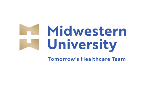
Starting this June, Midwestern University’s publications, marketing materials, social and web channels, and more will have a refreshed look and feel. Over the next few months, the University will gradually roll out a modern branding look that includes a new logo to compliment Midwestern’s existing University and College seals.
The updated branding is the result of over a year’s worth of internal and external research about the University’s image and impact in both healthcare education and the healthcare industry. Because an institution’s brand is a central element of any institution’s identity, Midwestern took great care in assessing how to refresh the University’s image and create an easily recognizable, impactful brand image while still honoring and incorporating Midwestern’s long history of quality healthcare education.
The new branding features a cleaner, more modern typeface with a new logomark representing both the University’s Illinois and Arizona campuses (an M representing the “Midwest” and a W representing the “West”) as well as a cross shape, the latter of which is used extensively in branded materials such as advertisements, publications, and admissions pamphlets. The cross shape is an important healthcare symbol which was adopted over 150 years ago when the Geneva Conventions adopted it to protect medical personnel assisting the wounded on the battlefield, and ever since then it has represented excellence in healthcare and a symbol of safety to people who need it.

The new logo and branding will be additional identifiers for the University in public-facing materials that will help Midwestern stand out to prospective students, healthcare industry peers, patients at the University’s community clinics, and the public.
Midwestern University’s official seal, as well as the seals of its 12 Colleges, will remain unchanged. The seals represent a proud history of over a century of healthcare education between the University’s two campuses. These seals will continue to be used in official documents, diplomas, and correspondence, as well as in key areas of the University’s campuses, as an important representation of the institution’s history and significance. With the addition of the new logo, the University will be able to use the official seals more selectively, which will help to emphasize their significance and meaning.
Midwestern University’s new logo and branding represent a continuing ethos and mission to move forward with an eye toward the future of healthcare and healthcare education. Find out more about our academic programs and community clinics and how we are helping to build Tomorrow’s Healthcare Team.